
Builder Xcessory simplifies the tasks of creating, changing, and maintaining graphical user interfaces (GUIs), thereby speeding up development and reducing costs. Developers work with a palette of user interface objects that can be selected, positioned, and combined to create the front-end of an application. Attribute or resource editors provide detailed control of the display and function of these objects. When the user interface looks right in the WYSIWYG (what-you-see-is-what-you-get) development environment provided by BX, a single menu selection generates error free C/C++, or optionally, Ada code. With up to 50% of a typical application being related to the user interface, the generation of an error-free GUI combined with the productivity of WYSIWYG development slashes the development cycle while increasing overall application reliability.
The purpose of this document is to provide a Quick Tour of BX. This tour provides you with a brief introduction to the breadth of capability provided by Builder Xcessory. It is not an intended to be instructional. To learn more about BX, you should:
- Watch the Video - This video, narrated by one of ICS's engineers, shows how to use BX. It only lasts 12 minutes and is well worth the time.
- Download an Evaluation - Try BX on your own system. ICS offers free 30 day trials of most products.
- Do the Tutorials - This is probably the best way to quickly learn to be an expert on BX. The BX tutorials start with the basics and proceed to advanced topics, including subclassing and styles.
- Read the Documentation - ICS maintains all its product documentation online. If you already have BX installed, you can access the BX manuals from the Help menu.
Getting Started
Starting BX is pretty simple. Once you have it installed, simply type:
% bx
at the command prompt.
The Main Window of BX includes a palette of user interface objects on the right that you will drag-and-drop to create your user interface. The user interface browser (the BX Browser) in the middle of the Main Window displays the hierarchy of the user interface you are creating. The objects displayed in this browser are "active"; you can select objects either in the user interface being developed or by clicking the corresponding widget in the browser. The screenshot below shows the Main Window after we have started building a user interface. 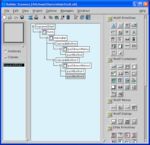
The Main Window of BX showing the widget hierarchy in the Browser. The Browser is "active" - you can select objects either in the user interface being developed or by clicking the corresponding widget in the browser.
The Resource Editor is the second main window of BX. As you build your user interface, you can modify all the X Resources of your widgets by simply selecting them in the Resource Editor and setting the desired values. In some cases, there are hundreds of different resources you can set for any given widget. To help you find the right resource quickly, the Resource Editor provides buttons to select different categories of resources (e.g., Visual Properties, Callbacks, Behavior, etc.). In addition, there is a very useful "Find" function at the bottom of the Resource Editor. In this example, we used the Find function to locate the resources to set the labelString for a pushbutton. 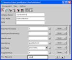
The BX Resource Editor allows you to customize Motif widgets for your application. The Find function of the Resource Editor allows you to quickly locate a particular X Resource.
Building Your User Interface
The first step in building your user interface is to select the target language for your application (e.g., C, C++, Ada, etc.). For more information on Ada code, see the BX Ada page. The available language choices for your installation of BX are accessible from the Options menu of the Main Window of BX. You should select your language prior to starting your user interface development to avoid using any features that may not be available for your development language (e.g., ViewKit is a C++ library and cannot be used with Ada). 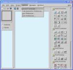
The first step in building your user interface is to select a target language for BX Code Generation.
Once you select Choose A Language..., a dialog box like the one below pops up that allows you to select the target language for BX code generation. Simply select the desired language and click OK. 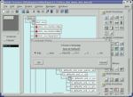
The code generation language selection box includes a variety of choices including C, C++, and (optionally) Ada.
Creating an user interface is simply a matter of selecting an object from the palette of Motif objects provided in the Main Window of BX and dropping it in the user interface you are developing. In the case of the top level shell, you can click anywhere on the screen and BX creates a window that will be the base for your application. In the screenshot below, we have created a top level shell (the window) and then dropped a single pushbutton onto it. 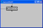
Your user interface is developed in its own window by dragging Motif widgets off the BX Palette and dropping them onto your GUI.
The Motif XmForm is a powerful widget that provides developers with the ability to control the geometry (i.e., size and location) of the child widgets of the application's user interface when the containing window is resized. The problem is that the power of the XmForm also comes with an increase in complexity. Many experienced Motif developers only use a small familiar subset of the capabilities of XmForm.
BX allows you to visually set an attachment of XmForm and then immediately test how your user interface looks as the window is resized. The following screenshot shows a XmForm constraint submenu being accessed by right clicking on an existing XmForm attachment. 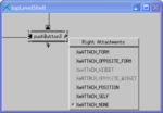
By right-clicking on an attachment of a widget placed within an XmForm, you can select the appropriate type of constraint.
Tailoring the User Interface
After populating your user interface with some widgets, it is time to start making it look like the GUI for your application. The process is simple - you first select a widget in either the actual user interface or in the BX Browser. This loads the widget and its resources into the BX Resource Editor. You then find the desired resource in the editor (we suggest that you use the Find feature) and change it. In the example below, we selected pushButton3 and used the Find command to locate the labelString resource of the button. We then entered the text "Push Me" for the value of the labelString resource. 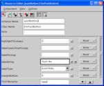
The resource "labelString" is found using the Find function, and the new value for the label, "Push Me", is entered.
After entering the new value for the text on the button, make sure you click the checkmark to the right to confirm your choice. Once you do this, your user interface will look like the following: 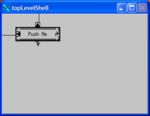
The name of the button is changed to "Push Me" after the modification is confirmed in the BX Resource Editor.
In addition to common resources like labels, fonts, colors, etc., you will need to define a "callback" for every user interface event that needs to be processed by your application. For example, the pushing of a button is considered an "activation" by Motif, so you need to define an "activateCallback". The routine that you define as the "activateCallback" will be called by your GUI when the button is pushed. The screenshot below shows us defining an "activateCallback" for the pushbutton. 
Specifying the name of the routine to "callback" when the button is pushed.
Testing Your User Interface
User interface creation is more than just placing objects on the screen. You really need to interact with it and test itsfeel too. You can do this by generating code, compiling, and executing your application. Depending on the size of your application, this can be a lengthy process that discourages user interface refinement through experimentation. 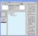
BX provides a Play mode that allows you to test the GUI you are building in an instance without leaving BX.
BX supports rapid user interface refinement by providing a Play mode. By simply switching BX into Play mode, you can push buttons, try menus, type in text fields, etc. Furthermore, by using the built in callback functions provided by BX, you can popup/popdown dialogs, make buttons sensitive/insensitive, manage/unmanage windows, set colors/fonts, etc. This allows you to further explore the GUI you are developing. Finally, if one of your GUI objects invokes a callback into your application, that callback is recorded in the message window of BX. 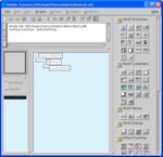
BX reports when a user defined callback will be executed by logging the callback in the BX Message Window.
When you are done testing your user interface, you can select Build mode from the Project menu in the BX Main Window. Once back in Build mode, you can make changes to your user interface and continue your development effort. 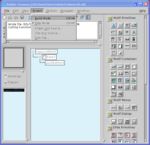
After you finished testing your user interface, select Build mode to continue development.
Generating Code
Most BX users go through this Build/Play cycle several times before they are ready for their GUI to drive the actual application. Once the GUI looks good on the screen, it is simply a matter of selecting the "Generate C" (or C++ or Ada) option from the File menu of BX. 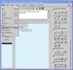
Generating 100% error free GUI code is simply a matter of selecting the "Generate Code" option from the file menu.
Machine generated code has historically had a bad reputation. In many cases, it is not only unreadable with no spacing, but also confusing and unmaintainable. However, this is not the case with BX. Not only is the code readable with the same quality of indentation as human generated code, but the structure makes sense. The developers of BX always took pride in generating code that they could be proud of if they had written it by hand.
BX generates several files when you decide to generate code. For our simple push button, BX will generate the following files:
- The BX UIL file for the user interface (uil.uil) - This is the file that stores the definition of your user interface. It is based on the UIL standard with compatible extensions added to deal with complex user interface concepts such as subclasses and styles.
- The default main program generated by BX - You can change the name of this file, as well as the names of other files generated by BX generated code, by modifying the code generation preferences. The BX code generation preferences are located under the Options menu of BX.
- The widget creation code - All of the widget creation code is collected into this one file. This file is normally rewritten whenever you re-generate code. If you need to make changes to this file, make sure you put your changes in the User Code Blocks. The contents of the User Code Blocks are preserved even when you re-generate code.
- The callback file - As you define callbacks, BX adds them to this file. This file is never overwritten, just appended.
- Makefile Template - BX automatically generates a Makefile for your application. The default template can be modified for your installation by systems management personnel.
- Apps Defaults file - BX supports developers who want to use the apps-default mechanism of BX to tailor their GUI and avoid locking down certain style issues in compiled code. The ability to easily create an App Defaults file is invaluable for applications that need to be localized. Security conscious organizations also use the Apps Default file to obscure the classified labels and metrics used in the actual application.
BX provides a number of mechanisms to further tailor the generated code to the needs of your application. The screenshot below shows a subset of the available options. 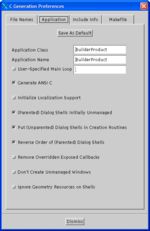
BX provides a powerful and flexible mechanism to gain complete control over a wide variety of Code Generation options.
Using Styles
An application's user interface should be consistent: buttons should be the same size, there should only be a couple of fonts used and the application should purposefully use colors to differentiate between alerts and normal operation. Unfortunately, a typical user interface starts off with very little consistency because the different pieces are being developed in parallel by multiple developers. More often than not, consistency is gradually introduced as new user interface concepts are reviewed and accepted by the user community.
BX supports the development as well as the retrofit of consistent user interfaces through the feature of styles. BX styles are similar to the concept of styles that you might find in any popular word processor. Specifically:
- A BX style is a group of X resources with user defined values.
- Styles can be created based on other styles and the new style can override the settings for the X resources of the parents, as well as add additional X resource settings of it own.
- Styles can be applied to an individual widget or to a whole widget hierarchy.
- Changes in a parent style are automatically propagated to any child styles.
Styles are created, edited, and applied from within the Style Manager. The Style Manager is opened by selecting it from the Managers menu of BX. An initial base style is provided by BX; however, you cannot set the values of resources in this style. The first step in using styles is to create your own substyle. To do this, simply right click on BaseStyle and select Create Substyle as illustrated in the following screenshot. 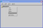
To use styles, you must first create your own substyle.
Once you have your own substyle, you must then add X resources to the style. You do this by right clicking on your style and selecting Edit Style. This will bring up the Style Editor. Near the top of the window is the Resourcescombobox. By clicking on the arrow to the right, a list of resources will appear. Simply click on any resources you want to include in the style. If you make a mistake and highlight the wrong resource, just click on it again to turn it off. When you are done selecting the X resources for your style, simply click the arrow again. 
The Style Editor is used to select resources to be included in the style.
The selected styles will be listed in alphabetical order below the Resources combobox. At this point you can assign a value to each of the resources. This value will be used to set the corresponding X resource on widgets on which this style has been applied. For example, if the foreground resource is set to White, applying this style to a widget will cause the foreground resource of the widget to also be White. If later you chose to change the foreground resource value from White to Green, simply changing it in the style will cause the foreground resource of any widget on which this style has been applied to also be changed to Green. You can also easily change the Style Name here by entering a different name in the Style Name text box and then hitting Apply. 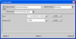
X resources included in the style can be individually set from within the Style Editor.
After applying and dismissing the Style Editor, the Style Manager will appear as in the screenshot below. Note the relationship between BaseStyle and MyStandardStyle. At this point you could add an additional style based on BaseStyle or create a new substyle from MyStandardStyle. 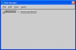
The Style Manager displays the relationship between the styles you define.
To apply a style, first select the widget or root of a widget hierarchy from within the BX Browser. Then apply the style by selecting the Apply menu and selecting one of the options displayed. Notice that in addition to the option of either applying to a selected widget or a selected tree, you can also do a Force. The use of the Force option will override any individual settings that have been explicitly set on an individual widget. If you do not use the Force option, an individually set value will retain its value. For example, you might want to set the size of a font in a particular text box to be very small while maintaining the same font and bold/italics settings. To do this, you would explicitly set the font size for the text box, and then do an "Apply to Selected Trees". This would apply the other font resources while allowing you to set the font smaller for this particular user interface widget. 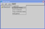
To apply a style, first select the root of the widget hierarchy in the BX Browser window and then select the appropriate option from the Apply Menu of the Style Manager.
The screenshot below shows the results of applying this style to our simple PushMe application. 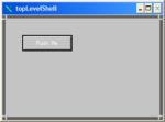
The PushMe application after the MyStandardStyle has been applied.
Styles are a very powerful and unique facility of BX. Its simplicity makes it ideal for most applications. However, developers of more complex applications with long project lives should carefully read the next few sections on Subclassing.
On-the-Fly Subclassing
As you build your user interface, it is very likely that you will notice that you are starting to reuse similar sets of objects. For example, you might have a main window with a menu system that is shared among several applications. Alternatively, you might have a warning dialog with different messages but a similar set of buttons. Obviously, you can just copy and paste the pieces you want to reuse. The problem with that approach is that it propagates additional copies, each of which must be separately maintained.
BX offers On-the-Fly subclassing as an alternative to the copy/paste approach to reuse. With BX, you simply right click in the BX Browser the top widget of the widget hierarchy that you want to subclass. Then select Make Class from the popup menu and BX will display a dialog to request a class name. Just fill it in and click OK. You now have a reusable subclass. 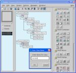
BX supports On-the-Fly subclassing by simply right clicking on a parent widget and selecting "Make Class".
After you create a new subclass, BX makes two changes:
- The new subclass is added to the BX palette under the category "Project Classes".
- The original set of widgets that was used as a basis for the class is collapsed into an instance of the new subclass.
The screen below shows the BX Browser after the creation of the class. 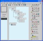
After making a new subclass, the class is automatically added to the BX palette and the Browser is updated to reflect the new class. The original basis for the class is now converted to an instance of the class.
Now that you have a class, you can reuse the class wherever you want. If you need to make a change, you can change the class and all the instances will change automatically. To change the class, you first go into class mode by clicking the radio button "Classes" that is on the left side of the BX Main Window. When you are in classes mode, only classes are displayed; all user interface instances are hidden. In addition, the background of the browser changes color to remind you that you are editing a class. In the screenshot below, we've switched into class mode and added a scrolledWindow to our class. The Browser has been updated to reflect this change to the class. 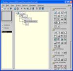
In class mode, all user interface instances are hidden and you can only edit classes. The Browser changes color to remind the user that BX is now in class mode.
Changes to a class are automatically propagated to all instances of that class. In the screenshot below, we've switched back to instance mode, and we can see that the corresponding instances of the class now also include a scrolledWindow. 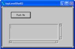
Changes made to a class are automatically propagated to all its instances.
Advanced Class Techniques
Classes are a powerful tool that you will find quite addicting. To be an expert subclasser, you need to understand two unique features of BX: resource exposure and object receptors.
One of the powers of object-oriented programming is that the external visibility of variables and functions defined in the class is also controlled by the class. This encapsulation ensures that users of the class do not use APIs or variables that are considered internal and subject to change.
When you create a class in BX, only very basic resources of a class (size, screen position, etc.) are available to instances of that class. In the example below, we have selected the instance of the "myclass" created previously and have loaded it into the resource editor. 
Classes encapsulate all resources by default and these resources cannot be changed in instances of that class without first explicitly exposing them.
To allow a resource to be changed in an instance of the class, the class must explicitly expose the resource. To expose a resource, you must first enter class mode. Once in class mode, locate the resource you want to be changed in the instances and select Expose. In the example below, we've decided to expose the labelString for the button. This is a simple example; we could have exposed any number of resources on any of the widgets that make up the class. 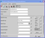
Resources are made available to class instances by selecting the expose option in the menu to the right of the resource (normally this is set to "None").
After switching back to instance mode and selecting an instance of that class, you can modify the resource. The screenshot below shows that we can now change the label for the button. 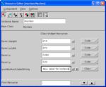
Once a resource is exposed in a class, the resource can be changed in the instance.
Subclassing is the other powerful concept of objects that allows further refinement/specialization of objects. BX supports this capability through object receptors. While in class mode, you can define a widget of a class to be areceptor. You can then subclass this object and add new widgets to the receptor. The next few screenshots will review this process.
The first step is to enter class mode by clicking the radio button next to Classes in the BX Browser. To illustrate the use of object receptors, we are going to add a Button Box to our sample class and designate it as an object receptor. A Button Box is a convenient Motif geometry management widget that allows you to align buttons in rows or columns and enforce common properties such as equal size. The Button Box comes standard in Open Motif 2.2. If you are using an UNIX system that only supports Motif 2.1, then ICS's EnhancementPak widget library includes a Button Box. However, before dropping the Button Box, we're going to cut the existing button so that we can later paste it into the Button Box. 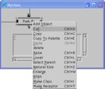
Widgets can be cut and later pasted back by right clicking on the widget and selecting Cut from the popup menu.
The Button Box is part of the Motif Container group and is represented on the BX palette as an icon with three small boxes. This container is selected on the palette and dropped on the user interface. 
The Button Box is a useful Motif Container Widget that simplifies the layout of buttons in either a horizontal or vertical grouping.
After adding the ButtonBox, we select it and then Paste the original button back into it. Finally, we move the row of buttons to the bottom of the dialog to follow conventional GUI design practices. 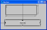
MyClass after adding a Button Box, pasting the original button, and moving the Button Box to the bottom of the dialog.
The next step is to set the Equal Size resource of the Button Box to ensure that all buttons added to it are the same size. 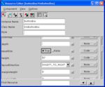
The Equal Size resource ensures that all buttons added to the Button Box will be automatically adjusted to be the same size.
To allow a subclass to extend its parent class, one widget in the parent class must be defined as a receptor. The easiest way to do this is to right click on the widget name in the BX Browser and select Make Receptor. In the case below, we are designating the Button Box as a receptor, thus allowing subclasses to further refine the content of the button box. 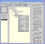
A widget is designated as a Receptor by right clicking on it and selecting Make Receptor.
Once you have a receptor defined, you can create a subclass by right clicking on the class in the BX Browser and selecting Make Subclass. A Dialog will pop up that asks you to provide a new name for the subclass. Enter your name (we used MySubClass) and click OK. The new class will appear in the BX Browser and a prototype will be created. 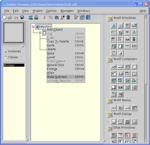
To create a Subclass, right click on a class in the Browser and select Make Subclass.
We then added three more push buttons to MySubClass. Notice how the buttons automatically resize to be the same size. 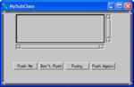
MySubClass after adding another button.
After switching back to Instance Mode, the new class, MySubClass, has been automatically added to the BX palette. 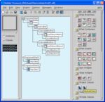
BX automatically adds the new subclass to its palette.
Want to try out the new subclass? Simply click on the new subclass and drag it out onto your desktop to create a new instance of the class. 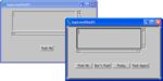
An instance of the new subclass MySubClass next to its parent class.
What's Next?
This tour is just the beginning. Builder Xcessory is a sophisticated tool that has many capabilities that we have not even had a chance to mention yet! The next step is to install an evaluation version of BX by visiting the Download Site for BX. Once installed, the BX tutorials are conveniently accessible from the Help menu.
If you have any questions, please send email to info@ics.com and we will do our best to answer them.